Channel report
Description
The channel report provides data on all events that are tracked in campaigns: sends, deliveries, opens, clicks, etc. You can get information either for one channel or for all of them at once. It is possible to group data according to various attributes, drill down into the report or use filters to get only the information you need. You can also compare metrics, for example, for different time periods or for different templates.
Get started by selecting Analytics —> Channels in the main menu.
The Altcraft platform allows an inaccuracy of 0.02% when generating reports.
Report settings
Channel report settings include:
- grouping data,
- adding filters
- saving the report.
On the right you can see the following buttons:
![]() List of reports —
open the list of ready reports;
List of reports —
open the list of ready reports;
![]() Export report —
download the report in csv or xlsx formats;
Export report —
download the report in csv or xlsx formats;
![]() Assigned groups —
assign access groups
Assigned groups —
assign access groups
Grouping data
By default, the report is built for all channels — Email, SMS, Push, Telegram, WhatsApp*, Viber™, Notify, MAX, as well as custom ones. To get data for a specific channel, select it in the "Report by field.
Next, set a period. You can set the date range in the calendar manually or choose one of the presets.
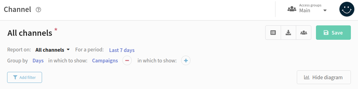
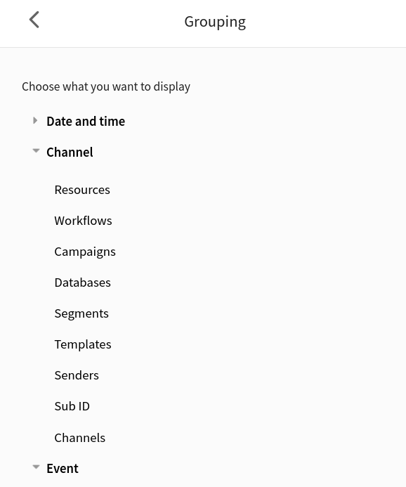
Select the attribute by which you want to group the data in the report. After that, you can detail the grouping by selecting the attributes one by one in the in which to show" field. Grouping is possible up to three levels.
You will see the attributes for grouping in the window on the right. They are divided into three categories:
Date and time. Group data by hours, days, weeks, months, quarters and years.
Channel. Group by platform objects (resources, scenarios, campaigns, mailings, segments, etc.).
Event. Group by link, domain, domain group, or provider.
Adding filters
| Categories | Available filters | Application |
|---|---|---|
| Date and time |
| Using filters you can add to the report or exclude from it data for a certain period of time. Such filters are convenient to view statistics only for specific days or remove statistics for holidays and weekends from the report. |
| Channel |
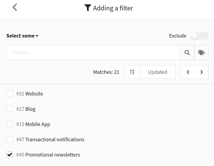
| Mailings filter helps get data only for a specific type of mailings. For example, if you want to analyze only trigger mailing metrics, select the appropriate mailings from the list. To search for needed mailings, you can enter their name or ID in the search bar or specify tags. To view metrics for mailings with a specific tag, switch Select some to Select by tag. A similar option is provided for any object in the "Channel" category. |
| Event |
| In case of deliverability issues, you can view data for each ISP separately by setting up a domain group filter. If you don't want the report to include data of recipients with your corporate email, select the domain filter, enter the corporate domain and exclude it. |
To filter data, click the "Add filter" button. A window will appear on the right where you can choose which data to include in the report.
If you need to remove some data from the report, click on the Exclude switch in the upper right corner.
After setting the filter, click Apply at the bottom of the page.
The added filters will be displayed in the report. There is no limit to the number of filters you can use. Click  to remove the filter.

Saving a report
You can save the current report settings. To do this, edit the name of the report (the default is "All Channels") and click the "Save" button. This is useful if you frequently query data using the same groupings and filters.
The saved report will be available to all users within group visibility.
Click  to open the list of reports. In a new window you will find default (system) and saved reports. Click on the name of the report to view it.
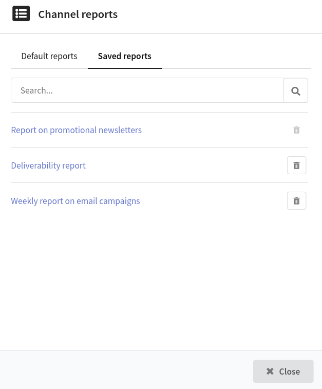
To delete a saved report, click  . However, you cannot delete the report that you are currently viewing.
Viewing a report
The report includes a table with data and a corresponding diagram. The chart can be collapsed by clicking on the Hide diagram button.
Diagram
The chart displays data based on grouping. When the report is grouped by days, weeks and quarters, the diagram shows the dynamics of changes in the metrics for the selected period:
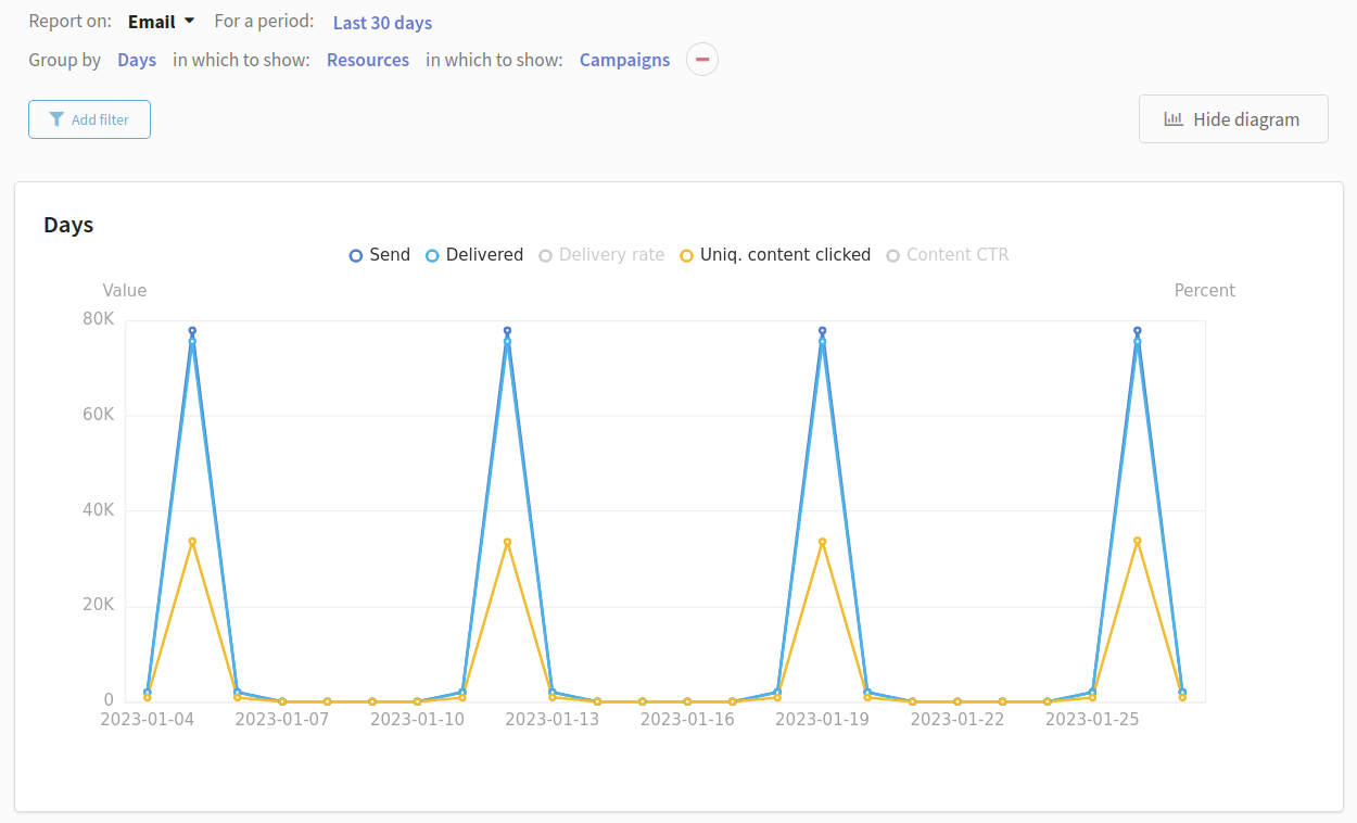
When grouped by hour, day of the week, month, year, or channel and event, the chart shows the ratio of quantitative or percentage metrics in the selected period:
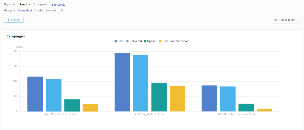
When you hover over the chart, you can see the exact figures.
The header contains the metrics displayed on the chart. Any column of the table can be displayed on the diagram, but the maximum number of indicators is 7. Click the metric to hide it.
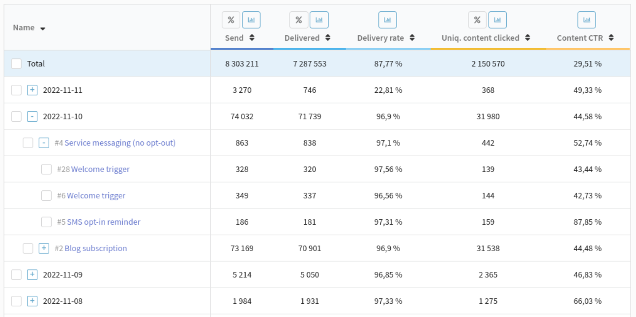
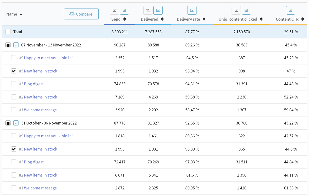
Data table
The table contains quantitative and percentage metrics of campaigns (sends, deliveries, clicks, unsubscribes, complaints, etc.). Description of metrics can be found below.
Metrics are grouped based on the report settings. Depending on the details of the grouping, the table structure may have nested elements.
For example, with the setting "Group by Campaigns, in which to show Mailings, in which to show Channels" the table will display the hierarchical structure of marketing strategy effectiveness.
With the setting "Group by days, in which to show Resources, in which to show Mailings" the table will display the following data:
To add a new metric to the table, hover over the column name and click  . Select a metric from the list. If you want to remove a column, click
  .
.
To move a column to another part of the table, you need to hover over the column name, hold down the left mouse button and drag the column to the desired position.
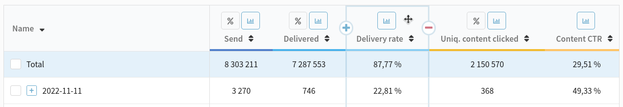
Other options:
 — switch quantitative metrics to percentages;
 — display a column on a diagram.
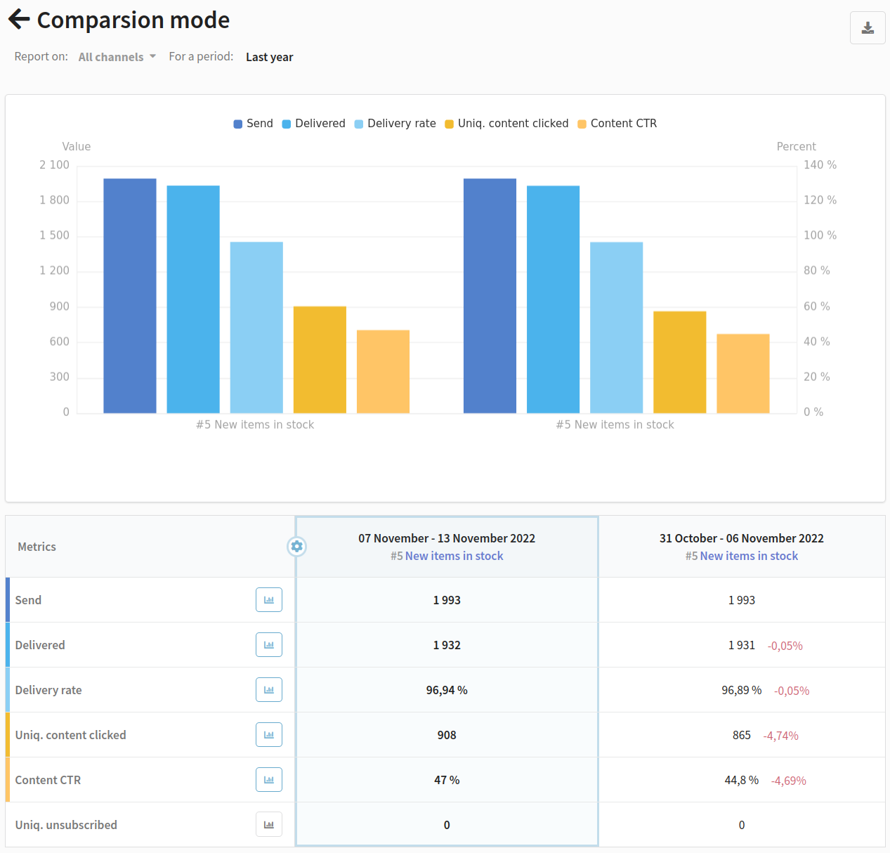
Comparing data
The comparison mode allows you to see data on several objects at the same time. For example, you can compare the performance of two templates or evaluate the change in campaign metrics from period to period.
To switch to the comparison mode, select the objects in the table that you want to compare. Click "Compare". It is possible to compare objects at different nesting levels.
The comparison mode also contains a chart and a table with metrics. In the diagram, the metrics for each object are grouped together.
The first object in the table is the comparison column. Other objects are compared with this object. The percentage increase or decrease of the metric is calculated relative to this object. To change the comparison column, click  and select a different object.
To go back to the general mode, click ← Comparison mode.
Report metrics
The uniqueness of any event is limited by the time specified in the platform configuration (UNIQUE_ACTIONS_TTL_MIN parameter). By default it is 1440 minutes. It means that a repeated event in a day will be counted as unique again. Check with your platform administrator for the uniqueness value set.
All indicators of unique events are marked in the table.
All metrics
| Metric | Channel | Description |
|---|---|---|
| Send | All | The total number of messages sent through all channels. |
| Undelivered | All | The total number of messages sent but not delivered through all channels. It consists of Hardbounced and Softbounced messages, delivery errors and messages which are not delivered due to undefined reason. |
| Undelivery rate | All | The percentage of undelivered messages through all channels. |
| Delivered | All | The total number of delivered messages through all channels. |
| Delivery rate | All | The percentage of messages delivered through all channels. |
| Opened | Email Push | The number of open messages. If the same profile opens a message multiple times, each open is counted. |
| Uniq. opened | Email Push | The total number of unique message opens through all channels. If the same profile opens a message multiple times, only one open is counted. |
| Open rate | Email Push | The percentage of profiles who opened the email or push. (Uniq. opened / Delivered ) * 100% |
| Replied | The number of replies to an email. | |
| Read | Email WhatsApp* Viber Notify | The number of emails read. An event is logged if the recipient opens the message and views it for at least 8 seconds. |
| Uniq. read | The number of unique reads of an email. | |
| Read rate | The number of unique reads of an email. (Uniq. read / Delivered) * 100% | |
| Glanced | An event is logged if the recipient opens the email and views it for less than 4 seconds. | |
| Skimmed | The event is logged if the recipient views the message for 4 to 8 seconds. | |
| Content clicked | All | The number of clicks on links. When a recipient clicks multiple times on the same link, each click event is counted. For example, if there are 3 links in a message and the recipient clicks each link twice, 6 clicks are counted. |
| Uniq. content clicked | All, but Telegram Group and MAX Group | Number of profiles that clicked any link in the message at least once. Counts profile engagement with message links. If the same profile clicks on any part of the message multiple times, only one click on the content is counted. Used to calculate content CTOR and CTR. |
| Uniq. link clicked | Email Telegram Bot WhatsApp* Viber Notify MAX bot | The total number of unique clicks on links in messages. Tracks only the first engagement per link per profile. Used to calculate link CTOR and CTR. |
| Content CTR | All but Telegram Group and MAX Group | The percentage of users who click on at least one link within a piece of content out of the total number of users who received it. (Uniq. content clicked / Delivered) * 100% |
| Content CTOR | Email Push | The percentage of users who clicked on any link within a piece of content out of those who opened/viewed it (rather than just received it). (Uniq. content clicked / Uniq. opened) * 100% |
| Link CTR | Email Telegram bot MAX bot Viber Notify | The percentage of clicks on the link within a message out of the number of delivered messages. (Uniq. link clicked / Delivered) * 100% |
| Link CTOR | The percentage of clicks on the link within a message out of the number of opens. (Uniq. link clicked / Uniq. opened) * 100% | |
| Camp. errors | All | Problems with message template generation. It occurs when a profile does not have a subscription to the resource selected in the campaign. |
| Deliv. errors | All | Problems with protocol during sending a message. |
| Suppressed | All | The number of messages that were not sent because the recipient's email address or phone number has previously been included in the suppression list. |
| Policy offenced | All | The number of violations of the sending policy. |
| Softbounced | The number of emails not delivered due to the inbox being full or the recipient's mail server being temporarily unavailable. | |
| Softbounce rate | The percentage of emails not delivered due to the inbox being full or the recipient's mail server being temporarily unavailable. | |
| Hardbounced | Email SMS Push | The number of messages that were not delivered due to an invalid email address, phone number, or push subscription ID. |
| Hardbounce rate | Email SMS Push | The percentage of messages that were not delivered due to an invalid email address, phone number, or push subscription ID. |
| Complained | Email SMS Push | The number of messages marked as spam by recipients. |
| Complains rate | The percentage of messages marked as spam by profiles. (Complained / Delivered)*100 | |
| Subscribed | All but Telegram Group and MAX Group | The number of subscriptions to resources in any channel. |
| Unsubscribed | Email SMS Push Viber Notify | The number of unsubscribes from resources, i.e. clicks on the unsubscribe link in the message. |
| Uniq. unsubscribed | Email SMS Push | The percentage of unique unsubscribes from resources. |
| Unsub to deliv rate | Email SMS Push | (Unsubscribed / Delivered) * 100% |
| Unsub to open rate | Email Push | (Unsubscribed / Opened) * 100% |
| Undefined | - | Unable to determine reason for non-delivery. |
Email channel
| Metric | Description |
|---|---|
| Send | The number of sent email messages. |
| Undelivered | The number of undelivered email messages. It consists of Hardbounced and Softbounced messages and messages which are not delivered due to undefined reason. |
| Undelivery rate | The percentage of undelivered email messages. |
| Delivered | The number of delivered email messages. |
| Delivery rate | The percentage of delivered email messages. |
| Opened | The number of opened email messages.
|
| Uniq. opened | The number of unique email message openings. If the same profile opens a message multiple times, only one open is counted. |
| Open rate | The percentage of recipients who opened the email. (Uniq. opened / Delivered ) * 100% |
| Replied | The number of replies to an email. |
| Read | The number of emails read. An event is logged if the recipient opens the message and views it for at least 8 seconds. |
| Uniq. read | The number of unique reads of an email. |
| Read rate | The number of unique reads of an email. (Uniq. read / Delivered) * 100% |
| Glanced | An event is logged if the recipient opens the email and views it for less than 4 seconds. |
| Skimmed | The event is logged if the recipient views the message for 4 to 8 seconds. |
| Content clicked | The number of clicks on links. When a recipient clicks multiple times on the same link, each click event is counted. For example, if there are 3 links in a message and the recipient clicks each link twice, 6 clicks are counted. |
| Uniq. content clicked | Number of profiles that clicked any link in the message at least once. Counts profile engagement with message links. If the same profile clicks on any link multiple times, only one click is counted. When grouped by links, it allows tracking which links users select first when engaging with the message. |
| Uniq. link clicked | The total number of unique clicks on links in email messages. Tracks only the first engagement per link per profile. If the recipient clicks on two different links in the email, 2 unique clicks on the link will be counted. |
| Content CTR | The percentage of users who click on at least one link within a piece of content out of the total number of delivered messages. (Uniq. content clicked / Delivered) * 100% |
| Content CTOR | The percentage of users who clicked on any link within a piece of content out of those who opened/viewed it (rather than just received it). (Uniq. content clicked / Uniq. opened) * 100% |
| Link CTR | The percentage of clicks on the link within a message relative to the number of delivered messages. (Uniq. link clicked / Delivered) * 100% |
| Link CTOR | The percentage of clicks on the link within a message relative to the number of opens. (Uniq. link clicked / Uniq. opened) * 100% |
| Camp. errors | Problems with message template generation. It occurs when a profile does not have a subscription to the resource selected in the campaign. |
| Deliv. errors | Problems with message template generation. It occurs when a profile does not have a subscription to the resource selected in the campaign. |
| Suppressed | The number of messages that were not sent because the recipient's email address was included in the suppression list. |
| Policy offenced | The number of violations of the sending policy. |
| Softbounced | The number of emails not delivered due to the inbox being full or the recipient's mail server being temporarily unavailable. |
| Softbounce rate | The percentage of emails not delivered due to the inbox being full or the recipient's mail server being temporarily unavailable. |
| Hardbounced | The number of messages that were not delivered due to an invalid email address. |
| Hardbounce rate | The percentage of messages that were not delivered due to an invalid email address. |
| Complained | The number of messages marked as spam by recipients. |
| Complains rate | The percentage of messages marked as spam by recipients. (Complained / Delivered) * 100 |
| Subscribed | The number of subscriptions to the email channel in resources. |
| Unsubscribed | The number of unsubscribes from resources, i.e. clicks on the unsubscribe link in the email message. |
| Uniq. unsubscribed | The percentage of unique unsubscribes from resources. |
| Unsub to deliv rate | (Unsubscribed / Delivered) * 100% |
| Unsub to open rate | (Unsubscribed / Opened) * 100% |
| Undefined | Unable to determine reason for non-delivery. |
SMS channel
| Metric | Description |
|---|---|
| Send | The total number of sent SMS messages. |
| Undelivered | The number of undelivered SMS messages. |
| Undelivery rate | The percentage of undelivered SMS messages. |
| Delivered | The total number of delivered SMS messages. |
| Delivery rate | The percentage of delivered SMS messages. |
| Content clicked | The number of clicks on links. |
| Uniq. content clicked | Number of profiles that clicked on any link in the message at least once. Counts profile engagement with message links. If the same profile clicks on any link multiple times, only one unique content click is counted. |
| Content CTR | The percentage of users who click on at least one link within the SMS message out of the total number of delivered messages. (Uniq. content clicked / Delivered) * 100% |
| Camp. errors | Problems with message template generation. It occurs when a profile does not have a subscription to the resource selected in the campaign. |
| Deliv. errors | Problems with message template generation. It occurs when a profile does not have a subscription to the resource selected in the campaign. |
| Suppressed | The number of messages that were not sent because the recipient's email address or phone number has previously been included in the suppression list. |
| Policy offenced | The number of violations of the sending policy. |
| Hardbounced | The number of messages that were not delivered due to an invalid phone number |
| Hardbounce rate | The percentage of messages that were not delivered due to an invalid phone number. |
| Complained | The number of messages marked as spam by recipients. |
| Subscribed | The number of subscriptions to the SMS channel in resources. |
| Unsubscribed | The number of unsubscribes from resources, i.e. clicks on the unsubscribe link in the SMS message. |
| Uniq. unsubscribed | The percentage of unique unsubscribes from resources. |
| Unsub to deliv rate | (Unsubscribed / Delivered) * 100% |
| Undefined | Unable to determine reason for non-delivery (unknown network error). |
Push channel
| Metric | Description |
|---|---|
| Send | The number of sent push notifications. |
| Undelivered | The number of undelivered push notifications. |
| Undelivery rate | The percentage of undelivered push notifications. |
| Delivered | The number of delivered push notifications. |
| Delivery rate | The percentage of delivered push notifications. |
| Opened | The number of opened push notifications. Web push: Number of opens equals number of deliveries. Mobile push: Open tracking depends on client-side implementation of event handling for links. Opens are recorded by the application itself and don't depend on whether the push notification contains links. |
| Uniq. opened | The number of delivered push notifications openings. If the same profile opens an notifications multiple times, only one open is counted. |
| Open rate | The percentage of recipients who opened the push. (Uniq. opened / Delivered ) * 100% |
| Content clicked | The number of clicks in the push notification (inluding links and buttons). For mobile pushes, clicks are counted only if the link includes tracking. Used to track redirects to websites. |
| Uniq. content clicked | If the same profile clicks the push notification multiple times, only one unique content click is counted. |
| Content CTR | The percentage of users who click on at least one link within a piece of content out of the total number of delivered messages. (Uniq. content clicked / Delivered) * 100% |
| Content CTOR | The percentage of users who clicked on any link within a piece of content out of those who opened/viewed it (rather than just received it). (Uniq. content clicked / Uniq. opened) * 100% |
| Camp. errors | Problems with message template generation. It occurs when a profile does not have a subscription to the resource selected in the campaign. |
| Deliv. errors | Problems with message template generation. It occurs when a profile does not have a subscription to the resource selected in the campaign. |
| Policy offenced | The number of violations of the sending policy. |
| Hardbounced | The number of messages that were not delivered due to an invalid push subscription ID. |
| Hardbounce rate | The percentage of messages that were not delivered due to an invalid push subscription ID. |
| Complained | The number of messages marked as spam by recipients. |
| Subscribed | The number of subscriptions to the Push channel in resources. |
| Unsubscribed | The number of unsubscribes from resources, i.e. clicks on the unsubscribe link in the message. |
| Uniq. unsubscribed | The percentage of unique unsubscribes from resources. |
| Unsub to deliv rate | (Unsubscribed / Delivered) * 100% |
| Unsub to open rate | (Unsubscribed / Opened) * 100% |
| Undefined | Unable to determine reason for non-delivery (unknown network error). |
Telegram Bot channel
| Metric | Description |
|---|---|
| Send | The number of messages sent through in the Telegram bot. |
| Undelivered | The number of messages sent but not delivered in the Telegram bot. |
| Undelivery rate | The percentage of undelivered messages in the Telegram bot. |
| Delivered | The number of delivered messages in the Telegram bot. |
| Delivery rate | The percentage of messages delivered in the Telegram bot. |
| Content clicked | The number of clicks on links. |
| Uniq. content clicked | If the same profile clicks on any link multiple times, only one unique content click is counted. |
| Uniq. link clicked | The number of unique clicks on links in messages. |
| Content CTR | The percentage of users who click on at least one link within a piece of content out of the total number of delivered messages. (Uniq. content clicked / Delivered) * 100% |
| Link CTR | The percentage of clicks on the link within a message relative to the number of delivered messages. (Uniq. link clicked / Delivered) * 100% |
| Camp. errors | Problems with message template generation. It occurs when a profile does not have a subscription to the resource selected in the campaign. |
| Deliv. errors | Problems with message template generation. It occurs when a profile does not have a subscription to the resource selected in the campaign. |
| Policy offenced | The number of violations of the sending policy. |
| Subscribed | The number of subscriptions to resources in the Telegram bot. |
| Undefined | Unable to determine reason for non-delivery (unknown network error). |
Telegram Group channel
| Metric | Description |
|---|---|
| Send | The number of messages sent to the Telegram group. |
| Undelivered | The number of undelivered messages in the Telegram group. |
| Undelivery rate | Percentage of undelivered messages to the Telegram group. |
| Delivered | The number of messages delivered to the Telegram group. |
| Delivery rate | Percentage of messages delivered to the Telegram group. |
| Content clicked | The number of click on links. |
| Camp. errors | Problems with message template generation. It occurs when a profile does not have a subscription to the resource selected in the campaign. |
| Deliv. errors | Problems with message template generation. It occurs when a profile does not have a subscription to the resource selected in the campaign. |
| Policy offenced | The number of violations of the sending policy. |
| Undefined | Unable to determine reason for non-delivery (unknown network error). |
MAX Bot channel
| Metric | Description |
|---|---|
| Undelivered | Number of messages not delivered to the MAX group |
| % Undelivered | Percentage of messages not delivered to the MAX group |
| Delivered | Number of messages delivered to the MAX group |
| % Delivered | Percentage of messages delivered to the MAX group |
| Content clicks | If a recipient clicks the same link multiple times, each click event is recorded. For example, if a message contains 3 links and the recipient clicks each of them twice, 6 clicks will be recorded. |
| Generation errors | An error occurred while generating the template. It happens when the profile does not have a subscription to the resource selected in the Campaign. |
| Transport errors | An error occurred in the message delivery protocols. |
| Policy limit exceeded | Number of messages not sent because the limit set in the sending policy was exceeded. |
| Unsubscribes | The profile unsubscribed from the MAX Group channel. |
| Reads | Number of messages read by the subscriber. |
| Undefined | The reason for undelivery could not be determined (for example, an unknown network error occurred) |
MAX Group channel
| Metric | Description |
|---|---|
| Undelivered | Number of messages not delivered to the chat with the MAX bot |
| % Undelivered | Percentage of messages not delivered to the chat with the MAX bot |
| Delivered | Number of messages delivered to the chat with the MAX bot |
| % Delivered | Percentage of messages delivered to the chat with the MAX bot |
| Content clicks | If a recipient clicks the same link multiple times, each click event is recorded. For example, if a message contains 3 links and the recipient clicks each of them twice, 6 clicks will be recorded. |
| Generation errors | An error occurred while generating the template. It happens when the profile does not have a subscription to the resource selected in the Campaign. |
| Transport errors | An error occurred in the message delivery protocols. |
| Policy limit exceeded | Number of messages not sent because the limit set in the sending policy was exceeded. |
| Unsubscribes | The profile unsubscribed from the MAX Bot channel. |
| Reads | Number of messages read by the subscriber. |
| Undefined | The reason for undelivery could not be determined (for example, an unknown network error occurred) |
WhatsApp channel
| Metric | Description |
|---|---|
| Send | Number of messages sent on WhatsApp*. |
| Undelivered | Number of undelivered WhatsApp* messages. |
| Undelivery rate | Percentage of undelivered messages on WhatsApp*. |
| Delivered | Number of messages delivered on WhatsApp*. |
| Delivery rate | Percentage of messages delivered on WhatsApp*. |
| Read | The number of messages read by the user. |
| Content clicked | The number of clicks on links. |
| Uniq. content clicked | If the same profile clicks on any part of the message multiple times, only one click on the content is counted. |
| Uniq. link clicked | The total number of unique clicks on links in messages. |
| Content CTR | The percentage of users who click on at least one link within a piece of content out of the total number of delivered messages. (Uniq. content clicked / Delivered) * 100% |
| Link CTR | The percentage of clicks on the link within a message out of the number of delivered messages. (Uniq. link clicked / Delivered) * 100% |
| Camp. errors | Problems with message template generation. It occurs when a profile does not have a subscription to the resource selected in the campaign. |
| Deliv. errors | Problems with message template generation. It occurs when a profile does not have a subscription to the resource selected in the campaign. |
| Suppressed | The number of messages that were not sent because the recipient's phone number has previously been included in the suppression list. |
| Policy offenced | The number of violations of the sending policy. |
| Subscribed | The profile subscribed to the WhatsApp* channel. |
| Undefined | Unable to determine reason for non-delivery (unknown network error). |
Viber channel
| Metric | Description |
|---|---|
| Send | The total number of messages sent through on Viber. |
| Undelivered | The total number of messages sent but not delivered on Viber. |
| Undelivery rate | The percentage of undelivered on Viber messages. |
| Delivered | The total number of delivered messages on Viber. |
| Delivery rate | The percentage of messages delivered on Viber. |
| Read | The number of messages read by the user. |
| Uniq. read | The number of unique reads in Viber chat. |
| Content clicked | The number of clicks on links. |
| Uniq. content clicked | If the same profile clicks on any link multiple times, only one click on the content is counted. |
| Uniq. link clicked | The number of unique clicks on links in messages. |
| Content CTR | The percentage of users who click on at least one link within a piece of content out of the total number of delivered messages. (Uniq. content clicked / Delivered) * 100% |
| Link CTR | The percentage of clicks on the link within a message out of the number of delivered messages. (Uniq. link clicked / Delivered) * 100% |
| Camp. errors | Problems with message template generation. It occurs when a profile does not have a subscription to the resource selected in the campaign. |
| Deliv. errors | Problems with message template generation. It occurs when a profile does not have a subscription to the resource selected in the campaign. |
| Suppressed | The number of messages that were not sent because the recipient's email address or phone number has previously been included in the suppression list. |
| Policy offenced | The number of violations of the sending policy. |
| Subscribed | The number of subscriptions to resources in the channel. |
| Unsubscribed | The number of unsubscribes from resources, i.e. clicks on the unsubscribe link in the message. |
| Undefined | Unable to determine reason for non-delivery (unknown network error). |
Notify channel
| Metric | Description |
|---|---|
| Send | The total number of messages sent through Notify. |
| Undelivered | The total number of messages sent but not delivered on Notify. |
| Undelivery rate | The percentage of undelivered on Notify messages. |
| Delivered | The total number of delivered messages on Notify. |
| Delivery rate | The percentage of messages delivered on Notify. |
| Read | The number of messages read by the user. |
| Content clicked | The number of clicks on links. |
| Uniq. content clicked | If the same profile clicks on any part of the message multiple times, only one click on the content is counted. |
| Uniq. link clicked | The number of unique clicks on links in messages. |
| Content CTR | The percentage of users who click on at least one link within a piece of content out of the total number of delivered messages. (Uniq. content clicked / Delivered) * 100% |
| Link CTR | The percentage of clicks on the link within a message out of the number of delivered messages. (Uniq. link clicked / Delivered) * 100% |
| Camp. errors | Problems with message template generation. It occurs when a profile does not have a subscription to the resource selected in the campaign. |
| Deliv. errors | Problems with message template generation. It occurs when a profile does not have a subscription to the resource selected in the campaign. |
| Suppressed | The number of messages that were not sent because the recipient's email address or phone number has previously been included in the suppression list. |
| Policy offenced | The number of violations of the sending policy. |
| Subscribed | The number of subscriptions to resources in the channel. |
| Unsubscribed | The number of unsubscribes from resources, i.e. clicks on the unsubscribe link in the message. |
| Undefined | Unable to determine reason for non-delivery (unknown network error). |
*The Meta organization, which owns Instagram, Facebook and WhatsApp products, has been declared as extremist and banned in Russia.
* Viber™ is a trademark of Rakuten Group, Inc. and is blocked in the Russian Federation.